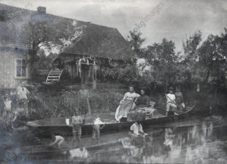
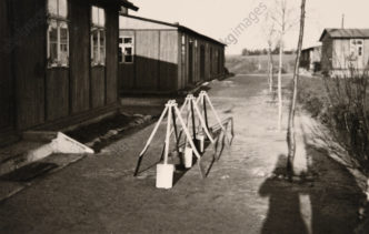
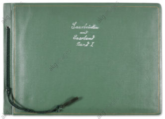
Folter auf der Leinwand – Die Schindung des Marsyas von Tizian


Vor einigen Jahren besuchte ich eine Tizian-Ausstellung, einer der Blockbuster der heutigen Kunstwelt. Nie war ich eine große Liebhaberin von Tizians Werk, aber ich erkenne natürlich seine meisterhaften künstlerischen Fähigkeiten an und so ging ich in die Ausstellung.

Oft wurde gesagt, Tizian war der erste wahre Impressionist und ich denke, diese Theorie wird durch einige seiner Werke begründet. Das Gemälde „Tod des Aktäon“ in der National Gallery zeigt klar impressionistische Pinselstriche und Röntgenbilder beweisen, dass Tizian viele seiner Werke ohne Unterzeichnung fertigte. Das Gemälde vermittelt extrem die Illusion von Geschwindigkeit und man glaubt fast das Rauschen der Blätter zu hören, wenn Diana Aktäon jagend durch den Wald läuft und der sich vor unseren Augen in einen Hirsch verwandelt. Das ganze Bild ist Hast und Jagd, was durch Tizians leichten Pinselstrich verstärkt wird.

Aber das Gemälde, das sich mir von allen der Ausstellung wirklich einprägte, war Tizians „Die Schindung des Marsyas“, ein Werk von gewaltigen 212 x 207 cm! Das Bild zeigt den Moment in dem Marsyas, als Strafe für seine Unverfrorenheit den Gott Apollon zu einem musikalischen Wettstreit herauszufordern, bei lebendigem Leibe die Haut abgezogen wird.

In den Sagen variiert die Geschichte leicht, aber die Grundaussage ist dieselbe: Der Satyr Marsyas fordert den Gott Apollon zum Wettstreit heraus, um den besten Musiker zu küren – Marsyas auf dem Aulos (eine Doppelflöte) oder der Lyra spielende Apollon.

Der Sieger kann mit dem Verlierer tun, was ihm beliebt und den Musen fiel das Schiedsamt zu. Unnötig zu erwähnen, dass diese den Gott dem Satyr vorzogen und Apollon ersann eine wirklich harte Strafe.

Das ist das Sujet, das Tizian für seine monumentale Leinwand auswählte; der junge Satyr hängt zusammen mit seinem Instrument gefesselt in den Ästen. Apollon (erkennbar an seinem Lorbeerkranz) häutet selbst mit ernsthafter Konzentration und scheinbarer Unschuld. Ein Helfer befasst sich mit den Beinen des Satyrs und eine andere Figur spielt Geige.

Auf der rechten Seite des Gemäldes ist eine Gruppe unbeteiligter Zuschauer dargestellt: Wir sehen ein anderes satyrähnliches Geschöpf, einen Jungen, einen Krone tragenden älteren Mann (der eine auffallende Ähnlichkeit mit Tizian hat) und zwei Hunde. Einer, kaum zurückzuhalten, scheint sich  auf Marsyas stürzen zu wollen. Der andere, ein kleiner Schoßhund, leckt gierig das warme Blut, das  aus den Wunden des Satyrs strömt.

Der Malstil dieses Spätwerks Tizians ähnelt dem von „Tod des Aktäon“ – der Pinselstrich ist frei und teilweise scheint es überarbeitet worden zu sein, um eine rasende, brutale und beinahe wollüstige Atmosphäre zu erzeugen, die sich in Marsyas Mimik noch verstärkt: voller Schmerz und Furcht, mit Tränen in den großen dunklen Augen seinem Schicksal ergeben.

Die Leinwand ist ungeachtet ihrer Größe übervoll. Davor stehend schaut der Betrachter direkt in Marsyas Gesicht und die Qualen, die diese schöne Kreatur zu erleiden hat, scheinen kaum ertragbar. Noch Jahre nachdem ich das Gemälde zum ersten und einzigen Mal im Original sah, verfolgt es mich und ich muss Iris Murdoch Recht geben, die es einst als das großartigste Gemälde des westlichen Kanon der Kunst(geschichte) bezeichnete.

Posted in Auf Deutsch | Leave a comment

Acting Out – Transformations

„He is the Lon Chaney of the tuxedo set“

I just read this sentence on my way to work in Jeanine Basinger’s excellent book on silent movie stars and it got me thinking about actors transforming themselves into their character, no matter how hideous they may be. This particular quote is about John Barrymore, the bad boy member of the Barrymore acting clan – he was hugely successful as an actor and matinee idol in silent movies and went on to have a very distinguished career in sound films before dying at the relatively young age of 60 in 1942, a shadow of his former self after years of heavy drinking.

Most of us still know Lon Chaney, both his name and his image, especially as the Hunchback of Notre Dame or the Phantom of the Opera. His status in film history is pretty unique, he was hugely accomplished in using his whole body to convey a character (something a lot of silent stars did) and he also did his own make-up. It is always a fascinating process to see people change into someone different and it is certainly a device that horror films have used since the movies began. It is not just the horror genre, though, which has made use of the dual personalities – Marion Davies, Julia Andrews in Victor/Victoria all the way up to Gwyneth Paltrow, playing two roles in Shallow Hal – actors seem to revel in the opportunity to play not one but two parts in the same movie.

John Barrymore excelled at transforming himself without much make-up into a totally different character such as in his celebrated success Dr. Jekyll and Mr. Hyde. Like Lon Chaney before him, who was still a star at the same time as Barrymore, he managed to convey this change with his entire body – the make-up only being apparent in later close-ups.

Why are we so fascinated with transformation? Do we all secretly long to be someone else? To play out all our different characteristics, desires, bad and good, pretty and ugly sides?

I’m sure there is some truth in this and many of us enjoy the opportunity to be someone or something different, be it at costume parties, Halloween or carnivals!

The selection of stills comes from the wonderful collection of our Spanish partner agency album, I hope you like them.

Posted in In English | Leave a comment

Jacques Louis David – Propaganda Genius?

At university I studied mainly French 18th and early 19th century art and Jacques Louis David obviously featured quite strongly. By the time it came to doing my MA in the Art of the French Revolution, I was totally immersed in French history painting. There are very few of those on view in London and most of the large David paintings are in the Louvre in Paris. We were only a small group and so we had spend some time in Paris and Versailles as well as going to the Museum of the French Revolution in Vizille near the French Alps. The museum there is a whole different story and will need its own future blog!

Back to Jacques Louis David. We had seen and discussed most of his large history paintings from the late 1780s such as “The Oath of the Horatii” from 1784, “The Lictors bring Brutus the Bodies of his Dead Sons” from 1789 and “The Intervention of the Sabine Women” from 1799, all in the same room at the Louvre.

The one major painting from the Revolutionary Period that isn’t in Paris but in Brussels is his “Death of Marat” from 1793. David went into exile to Brussels after the fall of Napoleon and it is here that he died on 29 December 1825.

I had never been to Brussels and in the pre Eurostar days had no really easy way of getting there short of flying. On one of my trips home I managed to persuade my sister to drive with me to Brussels for the day, look at the painting, have some food and turn round. I am so grateful to her to this day – it was a miserable journey, raining constantly, we were in a 2CV and my sister really wasn’t that interested in seeing the painting. Still, it was an unforgettable day and one that we will both remember if for different reasons!

I have always found the “Death of Marat” a fascinating painting – like most of David’s work during this time period it has a very strong political message and in this case even shows the artist’s own political convictions very clearly.


Jean-Paul Marat was a radical journalist and politician, a defender of the sans-culottes and close to Robespierre and Danton – the three of them were for a while the most powerful men in Revolutionary France. Marat ran a paper called L’Ami du Peuple (Friend of the People) in which he published lists of so-called enemies of the people, without much regard as to their guilt or innocence. By all accounts he wasn’t a handsome man, contemporaries commented on his toad-like appearance mainly caused by a chronic skin disease which he could only alleviate by sitting in a bath tub, the same kind that we can see in David’s painting.

Charlotte Corday, a young woman from Caen and a Girondin sympathiser came to see Marat on July 13 1793 under the pretext of wanting to supply him with more names of enemies of the people. She stabbed Marat in the chest and was guillotined for her crime on 17 July 1793. The background story is important to the understanding of David’s painting, especially as contemporary viewers would have been familiar with those details.

The first impression you get is one of an almost empty canvas, the top half of the painting shows nothing much except for an eerie light, the source of which we can’t quite make out. One of the main things to remember when looking at any of David’s work is that he never left anything to chance: he wanted his paintings to be understood in a certain way and he planted enough visual clues for the contemporary viewer to “get it”.

We see Marat’s dead or dying body slumped in his bath in a position not unlike the dead Christ as he is being taken down from the cross. David makes his intentions clear from the start, this was no ordinary man and he is being elevated to a saint pretty much from the first. Marat’s face looks much younger than his 50 years and the skin disease is not much in evidence – this is a young man’s toned body, his serene face turned towards the viewer. The murderess Charlotte Corday is nowhere to be seen but she is there in two visual clues – the bloody knife and the letter Marat is still clutching in his hand. Corday uses the old calendar and addresses Marat in a roundabout way in marked contrast to David own address at the bottom of the wooden box: À Marat de David, addressing him as a friend, and, crucially, he dates it  L’An Deux. This is Year Two of the Revolution which officially started 1 January 1793. Corday is unmasked in a way which would have been clearly understood at the time and David adds one more clue – the letter and banknote which is seen on the wooden box. Here is a different letter, from the widow of a Revolutionary asking for help with her children and the assignat on top suggests that Marat was about to make a charitable donation to her (as far as I know there is no evidence that Marat was indeed a charitable man). In David’s universe he was working in Spartan surroundings helping the poor while the Girondin sympathiser Charlotte Corday gained entrance under false pretence and murdered him in cold blood. A revolutionary martyr was thus visually created, not the only one in David’s work from this time but certainly the most famous.

Jacques Louis David managed to stay at the top of the art world through the Napoleonic era, not a small feat! He moved seamlessly from revolutionary to imperial subject under Napoleon Bonaparte for whom he created more unforgettable works such as the Coronation or Napoleon crossing the Alps, probably one of the most well-known images of the French Emperor.

It would take more space than this blog to discuss all David’s politically motivated paintings in detail but I hope you got a taste of what a political and artistic genius he really was.

History painting is anything but dull!


Posted in In English | Leave a comment

A trip through Les Arts Décoratifs, Paris

This blog post was written by Ulrike Haussen, the picture researcher at akg-images in Paris responsible for the Les Arts Décoratifs collection.

Yes, I confess, I am a museophile. I go to the museum in the same way other people go to church: my eyes wide open, not wanting to miss a single thing, daydreaming and imagining myself elsewhere. I am part of a silent community of visitors, standing in front of exhibits in the same way pilgrims pray before a holy relic in a chapel. Who was it that said that museums were modern-day cathedrals?

When I was first given the job of managing the integration of the photographic collections of Les Arts Décoratifs into our database, I was immediately beside myself with joy. However, I had to calm myself down and wait, as there were technical questions about file names, caption lengths and keywords which had to be discussed at length first!

Nevertheless, every time I visited Les Arts Décoratifs and walked through the permanent collections or explored the temporary exhibitions, I was once again filled with enthusiasm at finding myself in such an exceptional place, somewhere which can only really exist in a large city.

So what is Les Arts Décoratifs, Paris, exactly? 

Les Arts Décoratifs is located in the Rohan and Marsan wing of the behemoth that is the Palais du Louvre, running along the Rue de Rivoli and ending at the Pavillon de Marsan at the side of the Tuileries. This is the part of the Louvre built by Napoleon III in 1852 and which, much later, served as the seat of the Ministry of Finance, before becoming in 1905 the site of the UCAD, the Union centrale des Arts décoratifs, the forerunner of the current organisation.

The Musée Nissim de Camondo, which is also part of Les Arts Décoratifs, is located in the Hôtel Camondo, bordering the Parc Monceau.

The institution is not a national museum, but rather a private organisation (governed by the law of 1901 on not-for-profit associations), born out of a willingness by collectors to create a space dedicated to the preservation, promotion and dissemination of the decorative arts, in the wake of the Universal Exhibitions of the second half of the 19th Century.

After several years of structural and spatial reorganisation, the museum of Les Arts Décoratifs was reopened in 2006, with the collections of decorative arts, fashion, textiles and advertising displayed over 900 m2 of permanent gallery and temporary exhibition space.

Surrounding the large Nave, a vast central space used for temporary exhibitions, exhibits are organised chronologically and thematically. Thanks to this arrangement the visitor has an overview of other parts of the museum from several vantage points and at different heights.

The Study Gallery (Galerie d’études) covers two floors and is devoted to long-term exhibitions which display a variety of objects from all periods to illustrate a particular theme. The Toy Gallery (Galerie des jouets) is always a pleasure to visit with its fun, colourful layout.

The whole of the Marsan Pavilion is occupied by the collections, right up to the roof, and the view from the 9th floor mezzanine right down to the pyramid of chairs way below is worth taking a detour to see!

The Jewellery Gallery (Galerie des bjoux) is spread across two rooms, veritable jewellery boxes plunged into darkness from which glitter a thousand objects in gold, silver and precious stones. From this gallery the visitor turns into the Rohan wing, where the two other great collections of Les Arts Décoratifs are displayed, with a bias towards temporary exhibitions (of which there are 2 to 3 per year):

Fashion is presented over two floors, large glass cases occupying entire sections of wall from floor to ceiling which give the visitor the delicious impression of being able walk amongst pieces created by some of the most gifted creative talents in the world.

The space reserved for the advertising collection has its own character and offers a very particular type of escape, with its bare walls and the fireplaces and cabinets retained from the old palace. A narrow corridor runs though the middle just like on a ship, even down to its metal cladding and windows.

© Les Arts Décoratifs, Paris / akg-images

What is the speciality of Les Arts Décoratifs? 

Apart from the sheer diversity of their collections, it’s the composite nature of Les Arts Décoratifs that is so special, with its temporary exhibitions, its permanent galleries displaying numerous collections of objects, as well as “period rooms” in which sets of objects evoke a particular era.

Above all it is the amount of space and time through which the visitor travels within a relatively small location that’s amazing: collections dating from the Twelfth Century are only a hundred metres away from objects created in 2011, on display in a gallery at the other end of the building.

It is in this time machine that these objects, gathered from the past, present and future, are brought together, and all of them have a valued place in the daily lives of humankind. They shape, have shaped, and will shape the way in which we sit, eat, work, sleep, play and dress; they accompany us on our most essential activities, not only by decorating and adorning us.

We are here “where the beautiful meets the useful”, that is to say where the most successful, most eccentric, most charming, most unusual, most avant-garde examples of objects are kept, preserved safe under glass cases, yet accessible to all the everyday uses that one could make of them.

Alongside its conservation work, Les Arts Décoratifs has from the very outset had a policy of teaching and promoting contemporary creative art.

In addition to numerous educational visits, a multitude of art classes is offered in the Carrousel studios and at the École Camondo on Boulevard Raspail, the latter specialising in interior architecture and design. It is the École Camondo which gave us renowned designers such as Philippe Starck and Jean-Michel Wilmotte.

The gift shop at 107 Rivoli is definitely the place to be, with its large bookshop specialising in all of the decorative arts, as well as limited edition design objects, jewellery, fashion accessories and tableware created by contemporary artists. It is not only one of the most chic and fashionable meeting points in the capital, but also a vehicle for promoting creativity today.

When I’m not going mad in the shop, my favourite game in Les Arts Décoratifs is to ask myself: “If I could take home any three exhibits, what would they be?”

Well, there’s a lounge chair by Charlotte Perriand which dates from 1941 and was inspired by a stay in Japan: that would be on my list. I am almost ashamed to say that I’d also include an ostrich-leather Balmain coat from 1977. Last but not last, the 1938 Bugatti 57 SC Atlantic Coupe, which featured in a recent “Art of the Automobile” exhibition, that would be my third choice! It was whilst looking through the side window of this car and noticing that the windshield was separated in two by a border made of leather that I suddenly realised that beauty can indeed make one happy!

After each visit to Les Arts Décoratifs, I ask myself: Where have I just been? And when? It feels as if I was asleep on a 15th-century canopy, or as if I had woken up on board a spaceship blasting into the future, or as if I was sitting at dinner in the 18th Century, if only that inflatable plastic turtle had not taken me back to the beaches of my childhood. But where was I? I had just spent a few hours at Les Arts Décoratifs in Paris.

Ulrike Haussen
Picture Researcher, akg-images Paris


Posted in In English | Leave a comment

Les Arts Décoratifs, Paris

Ce texte a été écrit par Ulrike Haussen, iconographe en charge du partenariat avec les Arts Décoratifs, Paris.

Oui, je confesse, je suis muséophile. Je me rends au musée comme d’autres vont à la messe, j’écoute les yeux grands ouverts, je ne veux rien manquer, je me projette, je rêvasse. Faisant partie de la communauté silencieuse des visiteurs, je stationne devant des vitrines comme des pèlerins peuvent se recueillir devant une image pieuse dans une chapelle. Qui a dit que les musées étaient des cathédrales modernes?

Lorsque je me suis vue confier la mission d’orchestrer l’intégration des fonds photographiques des Arts Décoratifs dans notre base de données, je jubilais d’avance. J’ai dû m’accrocher pourtant pendant un long moment, où il était question de noms de fichiers, de longueurs de champs, de mots-clés.

Mais à chaque fois que j’allais aux Arts Décoratifs, me promener dans les collections permanentes ou découvrir des expositions temporaires, je fus à nouveau saisie de cette exaltation spontanée, de me trouver dans un endroit d’exception, tel qu’il peut seulement en exister dans les grandes métropoles.

Que sont Les Arts Décoratifs, Paris, au juste ?

Les Art Décoratifs sont localisés dans l’aile de Rohan et de Marsan de ce mastodonte qu’est le Palais du Louvre, celle qui longe la rue de Rivoli et qui prend fin dans le Pavillon Marsan du côté des Tuileries. C’est la partie du Louvre que Napoléon III fit construire à partir de 1852 et qui bien plus tard, a servi de siège au ministère des Finances, avant de devenir à partir de 1905 l’emplacement de l’UCAD, l’Union centrale des arts décoratifs, l’organisme précurseur des actuels Arts Décoratifs.

Quant au musée Nissim de Camondo, qui fait partie des Arts Décoratifs, il se situe dans l’hôtel particulier des Camondo, en bordure du Parc Monceau.

L’institution n’est pas un musée national, mais un organisme privé (association loi 1901 reconnue d’utilité publique), issu de la volonté de collectionneurs de créer un espace consacré à la conservation, de la promotion et de la diffusion des arts décoratifs, à la suite des Expositions universelles de la seconde moitié du 19e siècle.

L’année 2006 marqua la réouverture du musée des Arts décoratifs, après plusieurs années de réorganisation structurelle et spatiale. A présent, les collections des arts décoratifs, de la mode, du textile et de la publicité sont déployées sur plus de 900 m2 et réparties dans des galeries permanentes et des espaces d’expositions temporaires.

Autour de la grande Nef, vaste espace central dédié aux grandes expositions temporaires, sont organisés les parcours chronologiques et thématiques. Grâce à cet agencement, on a un aperçu des autres parties du musée depuis plusieurs points de vue, à hauteurs différentes.

La galerie d’études sur deux étages est consacrée à des expositions de longue durée, mêlant des objets variés de toutes les époques et illustrant chacun à sa manière une thématique posée. La galerie des jouets surprend toujours par une scénographie ludique et colorée.

Le Pavillon Marsan est occupé jusqu’aux combles, la vue en plongée depuis la dernière mezzanine au 9ème étage sur la pyramide des fauteuils en contre-bas vaut le détour !

La galerie des bijoux est répartie sur deux cabinets, véritables écrins plongés dans le noir où brillent mille parures en or, argent et pierres précieuses. Elle est une charnière avec l’aile de Rohan, où sont exposés les deux autres grands domaines des Arts Décoratifs, par le biais d’expositions temporaires (2 à 3 par an) :

La mode est présentée sur deux niveaux, de grandes vitrines occupant des pans de murs entiers du sol au plafond donnent la séduisante impression de pouvoir passer entre les modèles des créateurs et créatrices les plus doués du monde.

L’espace réservé à la publicité, porte son propre caractère et invite à une évasion toute particulière, avec ses cabinets et ses cheminées hérités de l’ancien palais dont on a mis les murs à nu, en gardant un étroit couloir au milieu qui rappelle celui d’un paquebot, avec son revêtement métallique et ses hublots.

Qu’est-ce qui fait la particularité des Arts Décoratifs ?

Certainement, mise à part la diversité époustouflante de leurs collections, c’est leur muséographie composite, formée à la fois par des présentations temporaires, et par des galeries permanentes avec des vitrines étalant des séries d’objets et les « period rooms », ensembles d’objets restituant une pièce d’une époque précise.

Mais c’est surtout l’espace-temps que l’on parcourt dans un lieu relativement restreint qui est étonnant, avec les collections datant du Moyen Age (à partir du XIIe siècle) qui se trouvent seulement à une centaine de mètres de la galerie d’actualité à l’autre bout du bâtiment, où l’on peut voir des créations de 2011.

C’est dans cette time-machine que sont rassemblés des objets qui ont de toutes époques passées, présentes ou à venir eu une utilité dans le quotidien des hommes. Ils ont façonné, façonnent et façonneront la manière dont nous les humains nous asseyons, mangeons, travaillons, dormons, jouons, nous habillons… ; ils accompagnent nos activités les plus essentielles, ne serait-ce celle de décorer et de nous orner.

Nous sommes ici « là où le beau rejoint l’utile », c’est-à-dire là où sont conservés les exemplaires les plus aboutis, extravagants, charmants, insolites, avant-gardistes qui soient – préservés dans des vitrines et hors d’atteinte, mais cependant virtuellement accessibles aux usages quotidiens que l’on peut en faire.

Outre la conservation du patrimoine, la politique des Arts Décoratifs est caractérisée dès ses débuts par la volonté d’enseigner et de promouvoir la création contemporaine.

En supplément de nombreuses visites pédagogiques, une multitude de cours d’arts plastiques est proposée dans les « ateliers du Carrousel » et l’école Camondo, située boulevard Raspail, spécialisée en architecture d’intérieur et en design, a formé des designers de renommée, comme Philippe Starck et Jean-Michel Wilmotte.

La boutique du 107 Rivoli est définitivement the place to be, avec sa grande librairie spécialisée dans tous les domaines des arts décoratifs, ses éditions limitées d’objets de design, ses bijoux, accessoires de mode et arts de la table de créateurs contemporains. C’est donc non seulement un des rendez-vous le plus chic et fashion de la capitale, mais en même temps un vecteur de promotion pour la création actuelle.

Quand je ne craque pas à la boutique, mon jeu préféré aux Arts Décoratifs est de me demander : « Et si tu avais le droit d’emporter trois pièces à la maison, lesquelles prendrais-tu ? »

La chaise longue de Charlotte Perriand, datant de 1941 inspirée d’un séjour au Japon, occupe une place fixe dans ma liste, j’ai presque honte de dire que c’est le cas également pour ce manteau en cuir d’autruche de la maison Balmain de 1977. Lors de l’expo « L’Art de l’automobile », le Bugatti 57 SC Atlantic coupé de 1938 était mon troisième choix, last not least ! C’est par ailleurs en regardant par sa vitre latérale et apercevant le pare-brise séparé en deux fenêtres entourées d’un liseré de cuir que je me suis rendue compte, foudroyée, que la beauté peut rendre heureuse.

Après chaque visite aux Arts Décoratifs, je me pose la question : Où suis-je allée ? Et quand ? Il me semble avoir dormi dans un lit à dais du 15e siècle, m’être réveillée dans une navette spatiale propulsée dans des contrées futures, de m’être assise à table au 18e siècle, si cette tortue en plastique gonflable ne m’avait pas ramenée sur les plages de mon enfance. Mais où suis-je donc allée ? J’ai juste passé quelques heures aux Arts Décoratifs à Paris.

Ulrike Haussen
Inconographe, akg-images Paris


Posted in En français | Leave a comment

If you’re appy and you know it…


Photograph © akg-images / George Mann

As soon as the iPad (mark one) was launched, it started appearing at trade fairs and conferences in the picture industry. It wasn’t just because the picture business is filled with gadget lovers: the fact is, photographs look really rather incredible on the iPad. Colours seem richer, blacks deeper and whites subtly shaded. Showing off new collections in client meetings, the iPad seemed to make the best photographs look even better, long after the initial novelty of the iPad had worn off.

That’s why we’re so pleased to announce our first two iPad apps launched this past week, each one focussing on a particular photographer. We had promoted both photographers before on our monthly newsletters: George Mann was a vaudeville star with a passion for cameras, and he took photographs throughout his career, documenting rehearsals and changing rooms, as well as his private life and his friends, including a young Ronald Reagan: one shot shows the (incredibly tall) Mann resting his foot on the future president’s shoulder, a lovely mixture of history and absurdity!

Photograph © akg-images / Peter Cornelius

The other photographer we chose for our first apps is Peter Cornelius, whose work we had previously showcased in a newsletter. We have the great honour of licensing a series of photographs Cornelius took of Paris in the 1950s in glorious, saturated colour. 1950s Paris was a glamorous, vibrant place, and on the iPad the pictures seem even more glorious. One shot shows three young people surrounding a motorbike on the Rue du Petit Pont. Perhaps I shouldn’t show favouritism, but I absolutely adore this photo, it seems almost like a cinematic recreation of the 1950s: the young woman with a Pan Am bag at her feet; the young boy in his leather jacket and denim glancing (scowling?) at the photographer; the posters plastered all over the back wall advertising everything from karate lessons to a performance of Beethoven’s ‘Eroica’. The photograph is so beautifully composed and the colour palette has mellowed so attractively over the years:, it’s by far my favourite Cornelius shot in our collection, and I am over the moon that this app will bring Cornelius’ and Mann’s work to a new generation of technophiles!

Both apps are now live and downloadable on the iTunes store:
George Mann: American Master
Paris in Colour: The 1950s photography of Peter Cornelius

The apps were developed with the team at Artfinder. You can find Artfinder online at www.artfinder.com, on Facebook and via Twitter.

Posted in In English | Leave a comment

Torture on canvas – Titian’s „Flaying of Marsyas“

A few years back I went to one of those blockbuster exhibitions – paintings by Titian in the National Gallery in London. I have to admit that I was never a huge fan of Titian’s work but I do recognise his masterful painterly skills and so I went. It has often been said that Titian was really the first Impressionist and I think that theory is certainly borne out by some of his work. “The Death of Actaeon” in the National Gallery clearly shows impressionist brushstrokes and x-rays have proved that Titian didn’t use any underdrawings in many his works. The painting conveys the illusion of speed extremely well and one can almost hear the rustle of leaves as Diana runs through the woods chasing after Actaeon who is changing into a stag before our very eyes. The whole image is one of haste and chase which is definitely helped by the very loose brushwork Titian uses here.

The image that really stuck in my mind from that exhibition, though, was Titian’s “Flaying of Marsyas”, a pretty huge canvas at 212 x 207cm! The painting shows the moment the satyr Marsyas is being flayed alive for having had the audacity to challenge the god Apollo in a musical contest. The story varies slightly in different sources but the main drift is the same: Marsyas challenges the god Apollo to a musical contest to see who the better musician is; Marsyas on the aulos (a double flute) or Apollo on the lyre. The winner would be allowed to do as he is pleases with the loser and the contest was to be judged by the muses. Needless to say, they chose the god over the satyr and Apollo metered out a very harsh punishment indeed.

It is this moment that Titian has chosen for his monumental canvas; the young satyr strung up between branches and his instrument hung up too. The god Apollo himself (recognisable by his laurel wreath) is doing some of the flaying himself with an intense concentration and a seeming innocence. Another man is working on the satyr’s legs with another figure playing a violin only the left hand side, a macabre musical accompaniment. On the right side of the painting is an even stranger group of onlookers: We see another satyr-like creature, a young boy and an older man with a crown (a remarkable likeness to Titian himself) and two dogs. One, barely held back, seems intent on leaping at Marsyas and a little lap dog, greedily licking up the satyr’s warm blood as it gushes from his wounds. The painting style of this late work by Titian is similar to that of “The Death of Actaeon” – the brushwork is loose and it seems to have been reworked in places creating a frenzied, brutal and almost lusty atmosphere which is only strengthened by Marsyas’s face: full of pain and fear but also resignation to his fate, his big dark eyes shimmer with tears. The canvas feels crowded despite its size and standing in front of the canvas, the viewer is almost at the height of Marsyas’s face and the anguish suffered by this beautiful creature almost seems too much to bear.

Even years after seeing the painting for the one and only time in the original it still haunts me to this day and I have to agree with Iris Murdoch who once called it the greatest painting in the western canon.

Posted in In English | Leave a comment

Face to Face – Renaissance in Berlin

I can’t remember an exhibition that has created quite as much interest as the Faces of the Renaissance which is on at Berlin’s Bode Museum at the moment! My colleague and I had booked our “Early Bird” tickets quite some time ago which was just as well as pre-booking has now all sold out and the only way to get in would be to queue for the tickets first and then waiting for up to 5 hours to finally get in and coming face to face with some of the most beautiful paintings art has to offer.

Portrait painting is an art that has always fascinated me as anyone who read my blog about Botticelli’s  young man at the National Gallery in London already knows! I always find myself wondering what the people depicted might have been like in real life, what they talked about as they sat for their portraits or what they did for a living to be able to afford having their portraits painted by some of the most well-known artists of their time.

The exhibition in Berlin is beautifully laid out concentrating on the centres of art in Italy, Florence and Venice, as well as the different courts with a special room just for the Medici. The rooms are kept pretty dark which makes the viewing of the portraits more intimate and you concentrate on every face much more intently. We could see clearly how fashions changed in the different decades and different cities, from hairdos and necklines in the women and different types of hats and caps for the men. Some of the men and women look incredibly modern similar to my beloved Botticelli and it always seems to be those who feel the least idealised.

The exhibition not only shows portrait paintings but also sculpture, drawings and medals. The drawings were a revelation – not only the fact that they have survived on paper for such a long time but also the immediacy and intimacy of them. Sometimes the drawings are hung next to the finished portrait paintings which gives you and amazing insight into how the artist worked. The marble and sometimes terracotta busts have a slightly unreal quality, especially the ones without pupils which makes them look very eerie!

The star of the show is Leonardo’s “Lady with the Ermine”, one of only four female portraits he painted. For a long time it wasn’t clear if the lady in question would be lent and she hasn’t made it into the catalogue but she is on bags, many postcards, magnets and much more arty kitsch. She will only be in Berlin until the end of October when she will travel to London for an exhibition on Leonardo. When I was in London in August I saw her everywhere on posters advertising the forthcoming show. Would the young Cecilia Gallerani ever have imagined that her portrait would be one of the most famous faces in the world hundreds of years later? I doubt it.

Cecilia has her own guard and is covered by protective glass but all this security doesn’t distract from the beauty of her delicate face. One thing that struck both me and my colleague, however, is her very masculine hand holding the ermine, something I had never noticed in all the reproductions I had seen of the painting. Once you have seen it, though, similar to the Mona Lisa’s smile, you can’t take your eyes of them and it the entire proportions of this wonderful portrait suddenly seem off. Don’t take my word for it, though, if you want to see for yourself, get down to the Bode Museum and take your place in the queue, it will be worth it, I promise!

Posted in In English | Leave a comment

I belong to London, and London belongs to me

© akg-images / Walter Limot

My summer holiday suitcase usually contains: shorts, t-shirts, a beach towel, the highest-factor sun cream I can find… and a tower of books to read. I have yet to succumb to an e-reader, so a lot of my time packing for summer involves carefully wrapping five or six novels in towels. Even if I am taking books to read on the beach, I am damned if I am going to let them get dog ears or broken spines.

It makes me wince to admit it but, with books, I know what I like but I usually have no way of expressing why I like it. I am not a natural reviewer of books. This is something I realised during university, thankfully early enough to ditch plans to study 18th- and 19th-century German and Italian literature and swap over to History of Art, which, given my subsequent career path, was a wise decision.

This year’s reads were a mixed bag: a Booker nominee, a Japanese crime thriller, some H.G. Wells short stories, but the stand-out read was a book about which I knew nothing and which I had bought for one (admittedly shallow) reason: it was set in a boarding house just around the corner from where I live in South London.

The book was Norman Collins’ London Belongs to Me, first published in 1945 and reissued in 2009 as a Penguin Modern Classic. About halfway through its 738 pages, I realised that – as long as Collins didn’t spectacularly mess up the next three hundred pages – this was likely to be the best novel I had ever read. In the Penguin introduction the book is almost apologetically referred to as a B novel. Well, I reasoned, there are plenty of 30s and 40s B movies I love, so I wasn’t going to let that sway my judgement!

London Belongs to Me (published in the US as Dulcimer Street) follows the lives of the inhabitants of one boarding house in Kennington from 1938 through to 1940. It covers an incredible range of plots: from murder to spiritualism and from the health and safety dangers of tinned salmon to the immediate effects of the Second World War. Although there are plenty of modern authors drawing on the drama of World War Two to excellent effect – Sarah Waters’ recent Night Watch springs to mind as a fantastic novel about Londoners surviving against Hitler – there is something incredibly immediate and honest about books set around the Second World War written during or immediately afterwards. (Ute has already written about the success of Hans Fallada’s Alone in Berlin and there were plenty of people reading Suite Française on my morning commute a couple of years ago.)

Although I was reading the book on the beach, there were lots of little local thrills (“ooh, he’s on the number 3 bus – that’s my bus”; “wow, she’s just mentioned Oval station, that’s my tube station”).  I was reminded of the office and of images we have in the archive of London in the 1930s, particularly those by the French photographer Walter Limot. In the novel , I was thrilled by the references to streets and landmarks that I pass every day, yet on paper they seemed strangely distant and different; in Limot’s photographs you see Hyde Park Corner, Westminster Abbey and the number 88 bus (another one of my buses). Again they’re familiar but oddly exotic.

Even if you don’t live on the number 3 bus route – and I am sorry if you don’t, it’s a particularly good route and a good one on which to take tourists – I would strongly recommend London Belongs to Me.  I can’t tell you why I liked it, but even without the thrill of recognising locations I would have still ended the book in much the same way, trying to hide the fact that I was in tears at the fictional lives of Londoners some seventy years ago whilst sitting on a beach in Turkey.

Posted in In English | Leave a comment

Alte Liebe

Ich bin verliebt – in einen Renaissancemann – im wahrsten Sinne des Wortes

Als ich das erste Mal Botticellis „Young Man“ in der National Gallery London sah, war es um mich geschehen. Als Studentin der Kunstgeschichte im ersten Studienjahr bereitete ich mich damals auf meine allererste Präsentation zum Thema Portraitmalerei der Renaissance vor – eine schreckliche Vorstellung. Die Wahl des Botticelli und eines etwas früher entstandenen Frauenportraits von Baldovinetti war leicht; vor Publikum zu sprechen keinesfalls.

Überflüssig zu erwähnen, dass ich wochenlang auf beide Gemälde starrte. Aber es war Botticellis Junger Mann, der mich fesselte und seitdem nicht mehr loslässt. Er mag zwar nur zweidimensional sein, aber für mich ist er lebendiger als jedes andere in der National Gallery gezeigten Portraits.

Das Modell hat etwas Geheimnisvolles, das durch den Bildtitel „Junger Mann“ nicht wirklich aufgeklärt wird.

Und so wird auch vermutet, es könne sich um ein Selbstportrait Botticellis handeln, gestützt durch den etwas schiefen Anschein seines Gesichtes, als ob er in einen Spiegel blickt. Das war für mich immer eine der Anziehungskräfte des Gemäldes. Dieser Makel macht den jungen Mann realer und letztendlich lebendiger.

Ich dachte mir immer: das ist ein modernes Gesicht mit dem längeren Haar und dem leicht arroganten Ausdruck von Verachtung und Coolness um die Mundwinkel. Würde er plötzlich aus seinem Bild heraussteigen, er würde nicht auffallen im London des 20. Jahrhunderts.

Welche Art Mensch war er zu seiner Zeit? Womit beschäftigte er sich? Wie alt wurde er? Oft stellte ich mir diese Fragen, ohne natürlich eine Antwort zu erwarten.

Jedes Mal wenn ich die National Gallery besuche, gehe ich auf kürzestem Wege zu meinem jungen Mann um hallo zu sagen und sicher zu gehen, er ist immer noch dort und so schön wie immer.

Unwichtig wie chaotisch es manchmal in der Welt zugeht, es kann nicht alles schlecht sein, solange Kunstwerke wie dieses existieren und Menschen bewegen und inspirieren, so wie der Botticelli in meinem Leben seit Jahren eine Rolle spielt. Ich liebe Museen und Galerien. Sie sind für mich Orte der Ruhe und egal wie angespannt ich mich fühle, sie beruhigen mich immer.

Mein junger Mann und ich haben in den 21 Jahren, die wir uns kennen, viel zusammen durchgemacht und er wird immer einen besonderen Platz in meinem Herzen haben.

Und so bin ich elektrisiert von der Chance, die sich akg-images bot. Die fantastischen Gemälde der Weltklassesammlung der National Gallery, von denen Botticellis Portrait nur eines ist, werden nun durch akg-images vertreten! Ich habe nur einige dieser wunderbaren Gemälde ausgewählt, um Ihnen eine Vorstellung zu geben. Ich hoffe sehr, Sie stimmen mit mir überein, dass das eine großartige Sammlung ist.

Posted in Auf Deutsch | Leave a comment